
 May 5, 2025 ·
  7 min read ·
  Summarize in ChatGPT
You’ve got traffic; visitors are landing on your website every day. But for some reason, they’re leaving without signing up, getting in touch, or completing a purchase, and it’s starting to show in your bottom line.
The truth is, most websites lose conversions for reasons that are surprisingly fixable. Factors such as slow load times, poor user experiences, vague messaging, or clunky checkout processes are all small missteps that can quietly chip away at trust and interest.
**Content Disclaimer**
In order to properly illustrate the most common reasons why website visitors don’t convert, I have randomly pulled websites from search results which suffer from the reasons discussed. I have blurred out any logos or brand mentions in the screenshots provided as to not publicly criticize any organization or person(s).
Why Website Visitors Don’t Convert
Traffic alone doesn’t equal success. You might see decent numbers in your analytics dashboard, but if visitors are leaving without taking meaningful action, such as submitting a form, making a purchase, or even engaging with your content, it’s a clear sign that something on your site is falling short.
1. You’re Not Showing Up On Google
If your site isn’t visible on search engines, it’s essentially invisible to potential customers. A site that doesn’t appear in search results won’t get traffic organically, and without traffic, conversions aren’t possible. Even when traffic exists, low rankings for irrelevant keywords can attract the wrong audience, who won’t convert.
You can use Google Search Console to confirm if your site is indexed and to monitor what search terms are bringing in visitors. If those terms don’t align with what your business offers, your content and SEO strategy may need to be adjusted. High-intent, long-tail keywords often produce better conversion rates than broader terms with little context.
Learn How To Improve Keyword Research Capabilities
2. Your Website Loads Too Slowly
A slow website drives users away before they even interact with your content, hurting both engagement and conversions. Small delays have big consequences, and a single second can mean 7% fewer conversions.
Some of the more common culprits include oversized images, too many scripts, inefficient hosting, or excessive third-party integrations. Tools including Google PageSpeed Insights and GTMetrix can pinpoint problem areas and recommend specific fixes to improve speed.
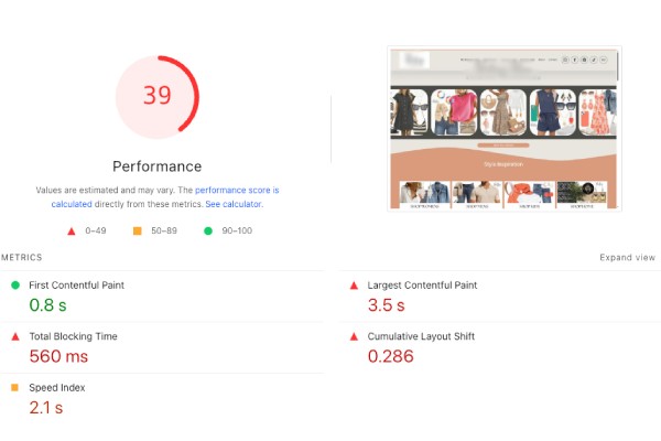
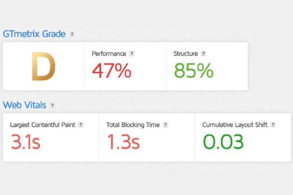
Both Figure 2.1 and Figure 2.2 showcase a poor Largest Contentful Paint (LCP) score, one of Google’s Core Web Vitals that measures how long it takes for the largest visible content (often a banner image, headline, or hero section) to fully load.
A high LCP (above 2.5 seconds) indicates that users are waiting too long to see meaningful content, which can lead to frustration and increase bounce rates. When users don’t see what they expect quickly, they’re more likely to abandon the page altogether, impacting engagement, time on site, and ultimately, conversions.
3. Your Visitors Don’t Understand What You Do
It’s more common than you’d expect. Vague taglines, buzzword-heavy headers, or poor visual hierarchy can confuse visitors about what a company actually offers. If it takes more than a few seconds to grasp who you are, what you offer, and who it’s for, visitors will move on.
The hero section of your homepage should communicate your value proposition clearly. Avoid generic phrases like “innovative solutions” and replace them with specific outcomes. If you offer water coolers, say so, or if you’re a bookkeeping service for freelancers, make that obvious from the first screen.
4. Your Calls To Action Are Weak, Vague, Or Hidden
Any calls to action (CTAs) need to be visible, clear, and timely. A well-placed CTA should tell visitors exactly what to do and what they get in return, or, in other words, your calls to action should speak to the user’s intent, not leave them guessing.
CTAs also need to function correctly, and broken forms, incorrect links, or CTAs that blend in with the rest of the page can silently kill conversions. Frequent testing is important, so check for broken links, typos, or display issues on different browsers and devices.
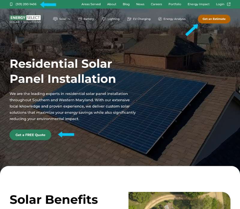
Figure 4.1 shows the residential solar panel installation services page from Energy Select, LLC, where there are 3 primary CTAs visible above the fold. Not only are these CTAs strategically placed and viewable as soon as a user enters the page, but the CTAs are also direct and descriptive as to what actions should taken by the user.
5. Your Site Lacks Social Proof
People want to know that others have successfully bought from or worked with you in the past, as it instills faith and trust in your brand. Testimonials, case studies, product reviews, and trust badges can all help build confidence and lower hesitation.
When these elements are missing or buried deep on your site, visitors have no reason to trust you over someone else, and even just a few well-written testimonials placed strategically can improve perceived credibility. For eCommerce stores, on-page product reviews are especially effective.
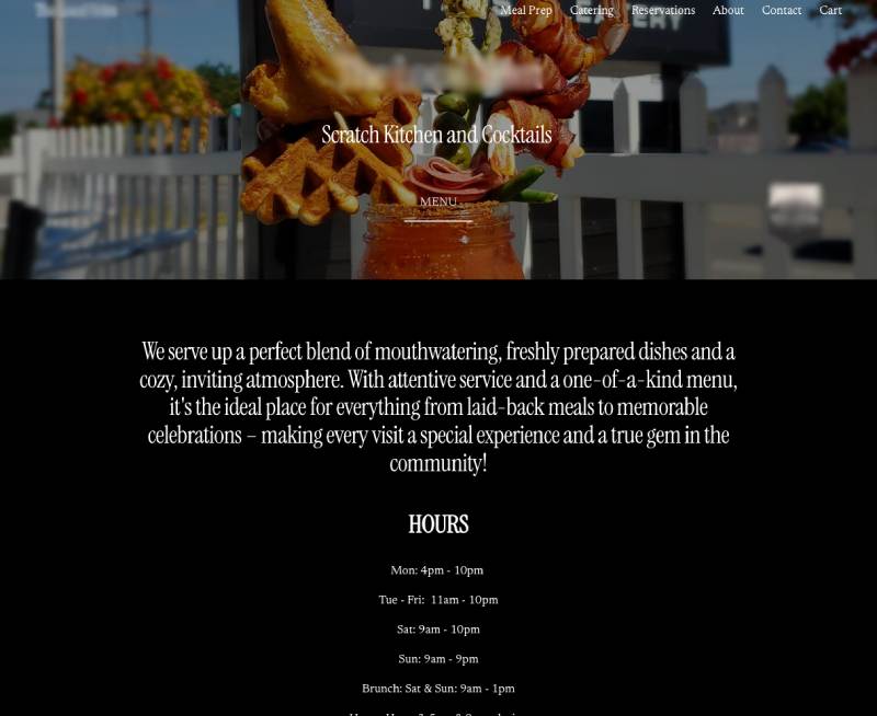
The homepage shown in Figure 5.1 lacks any evidence of showing customer testimonials, reviews of their food/services, or links indicating a social media presence. As a business which appears to offer catering services and in-restaurant food options, it is incredibly important to establish trust with new users by displaying customer reviews of their food and overall experience of the company’s services. If you were to find this restaurant online and it did not build trust right away, you are most likely going to find another option which does offer the trust and reputation an established food provider should provide.
6. Your Navigation Is Confusing
Good navigation helps visitors reach their goal fast without clicking around endlessly. A confusing menu, inconsistent page labeling, or too many nested categories can turn users off. If they can’t find what they came for, they’ll leave.
Analytics tools like Hotjar or GA4’s Path Exploration can help identify where users drop off or get lost. Test your site structure with someone unfamiliar with your content; challenge users to find a service and watch how easily they can get there and if they struggle, your site map needs refinement.
7. You’re Overwhelming Visitors With Too Many Choices
Choice paralysis is far too real. When people are faced with too many similar options, it becomes more difficult to decide, and they often choose nothing at all.
Instead of offering everything at once, you could organize your products into different categories or bundles. Try to use filters to help users narrow options based on what they care about: price, size, material, features, etc. If your company offers services, break down offerings into clear packages or varied tiers.
Turning Missed Opportunities Into Measurable Growth
A high-traffic website that fails to convert is a lost opportunity, and is one that quietly drains your time, budget, and potential.
From technical issues to messaging gaps, the smallest friction points can have a big impact on your ability to turn visitors into customers. Outside expertise brings a fresh perspective, the right tools, and a proven process to help identify what’s working, what’s stalling, and what needs to be realigned to drive results.
At 321 Web Marketing, we specialize in helping businesses turn underperforming websites into revenue-generating assets. Our leading SEO consulting and digital marketing strategies are built to increase visibility, attract the right audience, and drive real conversions that improve revenue.
Contact us today for a consultation and speak to a strategist to learn how our team can help you close the gap between traffic and sales.
Kim Greer
OFP Law
One of the best business decisions I ever made was to contract with 321 Web Marketing. Jonathan Gessert and his team are knowledgeable, efficient, and effective, making digital marketing goals easy to achieve and helping [...]
Kelly Cole
Business Benefits Group
My company hired 321 Web Marketing in February 2016 to resurrect our web site. We feel our web site is the face to our business and desperately needed a make over. 321 took us from blah to WOW effortlessly and what a difference [...]
Emily Hawkins
Diener & Associates
Thanks to 321 Web Marketing, the client has seen an increase in their search engine leads, averaging 12 qualified leads per month. The client has also achieved prominent Google Maps and search placement. The team manages the engagement [...]
Trevor Telesz
Paw Pals Pet Sitting
321 Web Marketing successfully translated the client’s design into a stunning and refreshed website, ensuring seamless functionality across all dynamic views. The team provided clear timelines and stuck to them, keeping everything [...]
Corey Davis
Spartan Animal & Pest Control
321 Web Marketing is truly phenomenal at what they do. Their ability to communicate and describe the steps and actions that they are implementing , Alex Zarpas in particular, is excellent. Delivering on promises is all they have done for me [...]
Alec Roberts
MFE Insurance
I can’t say it enough, Jonathan and his team have gone above and beyond since day one to accommodate our needs and meet our goals. I run a specialty insurance brokerage based in LA and once we found 321 we never looked [...]
Richard Wilbur III
Advantage.Tech
Thanks to 321 Web Marketing’s web development work, the client increased rankings and traffic from search engines. Also, their business secured prominent positions on Google Maps and industry-relevant, profitable keywords. The client also [...]
Bruce Gemmill
FVCbank
After the website revamp, the client saw a steady rise in leads from search engines, resulting in additional traffic. 321 Web Marketing is highly punctual when it comes to deliverables, and internal stakeholders are impressed with the service [...]
Drew Weeks
VAE
321 Web Marketing delivered a sleek website that accurately portrays the size and quality of the client’s organization. All of their completed websites have received positive feedback from users who have been impressed by the UX/UI. The [...]
Ryan Masten
Masten Pools
321 Web Marketing has increased the client’s leads from zero to 53 monthly. Their SEO efforts pay off impressively due to a top-ranking position on Google and making the site the number one result for several local service keywords. The [...]