

 Nov 17, 2017 ·
  6 min read ·
  Summarize in ChatGPT
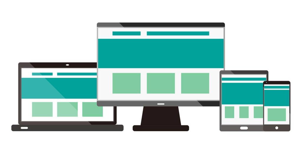
As web designers, we all want to create stunning websites that push the boundaries of innovation and creativity. Having access to impressive web design libraries is a major asset that will help inspire and streamline your project. From concept to creation, making design choices for your website can be a challenging task. The following amazing web design libraries are all HTML, JS, CSS, and jQuery based. Take your website to the next level with this collection of the best web design libraries on the web.
1. Select2
Select2 is a jQuery based replacement for standard select boxes displayed by the browser. It also offers support for tagging, searching, infinite scrolling, remote data sets, and other popular options. To use Select2, you must include the CSS and JavaScript file on your website. If your project currently contains unattractive select boxes and you want to add additional features to them, you will likely find Select2 very useful. Select2 is available via GitHub and can be installed with Bower, which serves as an interface to GitHub.
2. Chart.js
Chart.js is a JavaScript library that offers open source HTML5 charts for your website. With Chart.js, web designers have the opportunity to draw various types of charts using the HTML5 canvas element, which requires a polyfill to support older browsers. The library is a simple way to include interactive, animated graphs for free on your website. The charts are also responsive, meaning they will adapt based on available space. One of the biggest perks of Chart.js is its clear and extensive documentation that makes its features and options easy to learn and implement on your project.
3. TypeIt
Considered one of the most versatile jQuery typing plugins on the web, TypeIt allows web designers to type single or multiple strings that break lines, handle HTML tags and entities, and deletes and replaces each other. The typewriter-style text animation plugin is customizable and fully compatible with jQuery 3.2.1+. It is not only versatile and user-friendly; it also comes with companion functions that provide you with complete control over characters, speed, deletions, line breaks, pauses, and everything else. The code is available to use for any personal project, free of charge. If you wish to use TypeIt commercially, you will need to check out the license options that offer full support.
4. Animate.css
Animate.css is a collection of fun cross-browser animations for use in various projects. This simple CSS library helps you avoid having to write lines of CSS to animate elements on your website, making it the perfect choice for home pages, sliders, and overall emphasis. It takes less than an hour to understand exactly how it works and just a few more minutes to develop the skills necessary to master it. The amazing library contains more than 50 different animations, from bounce and rotating to flip and flash. Download the complete library for your personal use or customize and build it to meet your unique needs.
5. Bootstrap
Bootstrap is a useful tool for front-end developers. The open-source front-end web framework can be used for websites and web applications in the creation of web and interface components like tabs, carousel, modals, forms, and accordion. Bootstrap is fast, light, and easy to use, making it one of the most popular ways to build responsive websites. Originally named Twitter Blueprint, Bootstrap is a collection of handy code written in CSS, HTML, and JavaScript used by web designers and developers who want to quickly build fully-responsive websites. It is also free to use.
6. Font Awesome
Font Awesome is a popular icon and font toolkit based on LESS and CSS. Created for use with Twitter Bootstrap, the toolkit offers scalable vector icons that can be easily customized via color, size, drop shadow, or anything else using CSS. Font Awesome is designed to be used with inline elements and consists of a huge collection of icons to add to your website. As Font Awesome does not require JavaScript, there are fewer compatibility concerns. The library also offers infinite scalability, meaning the vector graphics look amazing at any size. Font Awesome is completely free to use for personal and commercial use.
7. Hover.css
Hover.css is a library of CSS3 powered hover effects that can be applied to featured images, logos, links, SVG, and buttons. Available in LESS, Sass, and CSS, the effects use a single element and are self-contained, meaning they can be copy and pasted in just a few clicks. Hover.css effects often use CSS3 features such as animations, transforms, and transitions. While old browsers typically do not support these effects, it is possible to set up fallback hover effects to take their place. Hover.css is available free for personal use. Paid commercial use is also available with a license for one application or for unlimited applications with the extended commercial license.
8. Bubbly-bg
Bubbly-bg creates fun bubbly backgrounds in less than 1kB. The customizable bubble animation uses JavaScript and canvas to create customizable bubble animation on an HTML5 canvas element. Bubbly-bg works by creating a canvas element that appends to the body and always fills the height and width of the viewpoint. This makes Bubbly-bg the ultimate plug and play for most projects. Bubbly.bg can also be used with your own created canvas by adding an extra line of code to your configuration. If you desire an animated background on your website, Bubbly-bg may be well suited for you.
Whether you consider yourself a novice web developer or professional web designer, it is important to know about the best frameworks, typography tools, and libraries available for your use. The amazing web design libraries mentioned are some of the best on the web and are available free for personal use, and in some cases, commercial use. These libraries help take the frustration out of developing a solution to a design problem. If you wish to save time and effort on your project, be sure to check out these useful web design libraries that we love.
Kim Greer
OFP Law
One of the best business decisions I ever made was to contract with 321 Web Marketing. Jonathan Gessert and his team are knowledgeable, efficient, and effective, making digital marketing goals easy to achieve and helping [...]
Kelly Cole
Business Benefits Group
My company hired 321 Web Marketing in February 2016 to resurrect our web site. We feel our web site is the face to our business and desperately needed a make over. 321 took us from blah to WOW effortlessly and what a difference [...]
Emily Hawkins
Diener & Associates
Thanks to 321 Web Marketing, the client has seen an increase in their search engine leads, averaging 12 qualified leads per month. The client has also achieved prominent Google Maps and search placement. The team manages the engagement [...]
Trevor Telesz
Paw Pals Pet Sitting
321 Web Marketing successfully translated the client’s design into a stunning and refreshed website, ensuring seamless functionality across all dynamic views. The team provided clear timelines and stuck to them, keeping everything [...]
Corey Davis
Spartan Animal & Pest Control
321 Web Marketing is truly phenomenal at what they do. Their ability to communicate and describe the steps and actions that they are implementing , Alex Zarpas in particular, is excellent. Delivering on promises is all they have done for me [...]
Alec Roberts
MFE Insurance
I can’t say it enough, Jonathan and his team have gone above and beyond since day one to accommodate our needs and meet our goals. I run a specialty insurance brokerage based in LA and once we found 321 we never looked [...]
Richard Wilbur III
Advantage.Tech
Thanks to 321 Web Marketing’s web development work, the client increased rankings and traffic from search engines. Also, their business secured prominent positions on Google Maps and industry-relevant, profitable keywords. The client also [...]
Bruce Gemmill
FVCbank
After the website revamp, the client saw a steady rise in leads from search engines, resulting in additional traffic. 321 Web Marketing is highly punctual when it comes to deliverables, and internal stakeholders are impressed with the service [...]
Drew Weeks
VAE
321 Web Marketing delivered a sleek website that accurately portrays the size and quality of the client’s organization. All of their completed websites have received positive feedback from users who have been impressed by the UX/UI. The [...]
Ryan Masten
Masten Pools
321 Web Marketing has increased the client’s leads from zero to 53 monthly. Their SEO efforts pay off impressively due to a top-ranking position on Google and making the site the number one result for several local service keywords. The [...]